
Building a Luxury Experience
Vita Estates
Bringing the elegance and warmth of Italy to every interaction.
Role
Founding Product Designer
Tools
Context
Figma, Webflow
At the very beginning of Vita Estates, the brand existed only as a vision: connecting American clients with Italy’s most exquisite properties and experiences.
As the sole UX/UI designer on the founding team, I translated that vision into an online experience guided by a single question:
How could Italy’s elegance and allure come alive?
Team
1 Designer, 2 Developers, 1 Brand Strategist, 1 Leadership
Project at a Glance
Solution
I designed and launched Vita Estates’ first platform that wows clients, guides them with ease, and stays true to the brand’s vision.
Objective
Vita Estates needed a stage worthy of its luxury offerings: real estate, travel concierge, and wedding planning.
Design Process
I began with research, meeting the CEO and social media team to understand the luxury market, client expectations, and Vita Estates’ three services.
Next, I sketched wireframes, built interactive prototypes, and refined the experience through iterative feedback.
I then collaborated with the developers to bring the designs to life in Webflow, ensuring the visuals and interactions matched the vision.
Establishing Platform Vision
Target Groups
The brand tone was defined as aspirational yet approachable: warm, authentically Italian, and elegantly refined. Language is romantic and experiential, drawing clients into weddings and lifestyle experiences.
Brand Tone
The mission was defined as curating Italy’s finest properties and experiences for U.S. clients, delivering luxury flawlessly under one trusted brand.
The platform was designed around three key audiences, each with unique needs but a shared desire for a refined, seamless Italian luxury experience.

Mission
What We Were Up Against
Balancing luxury aesthetics with clarity
Aligning three distinct services under one cohesive UX
Streamlining complex content for intuitive flow
Exploring Early Concepts
The Spark
Shaping Ideas
#1: Initial sketch exploring layout ideas
Aha Moments
The challenge was clear: how could we create a digital experience that felt refined and exclusive, while remaining intuitive and easy to navigate?
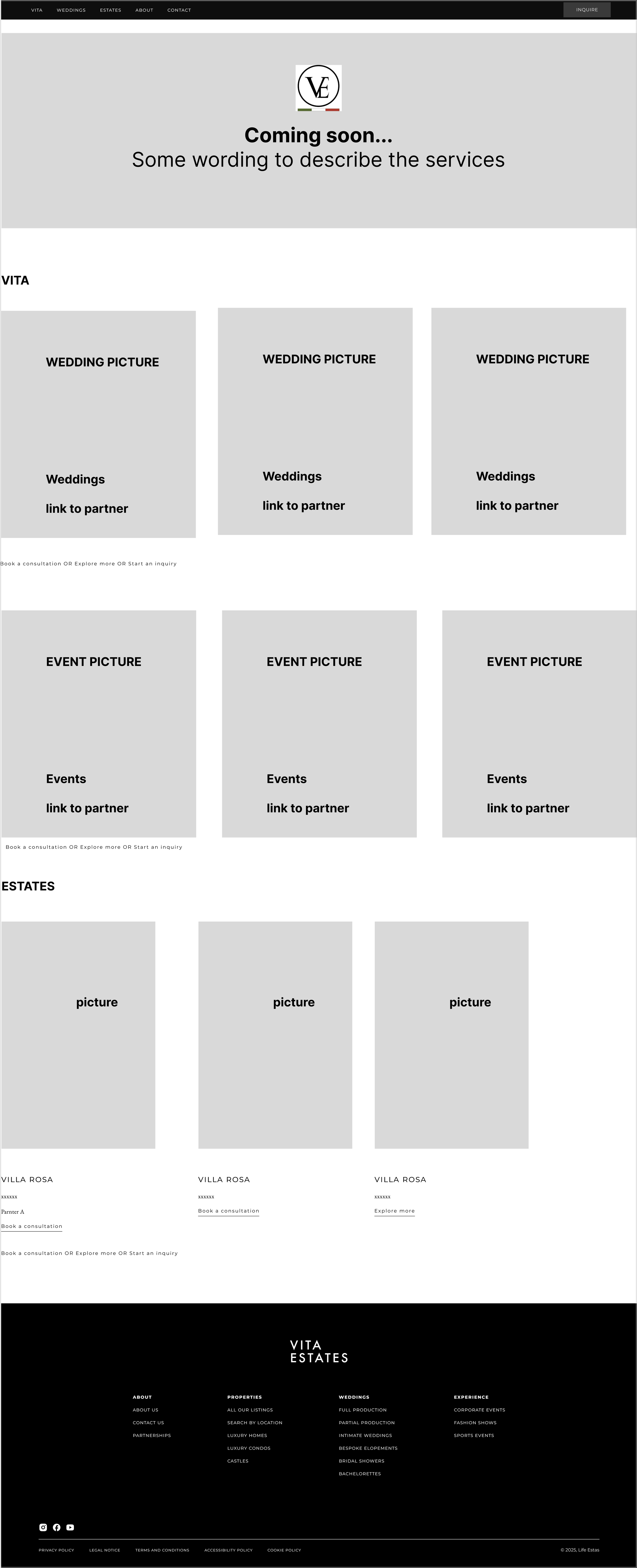
We began with rapid sketches and low-fidelity wireframes, exploring multiple layouts to showcase property, culture, and experiences cohesively.
Early explorations also focused on navigation patterns, ensuring users could move effortlessly between the three services. Designs ranged from minimalist visuals to richer modular concepts.
#2: First lo-fi wireframe testing structure
#3: First hi-fi wireframe with visual design
The aha moment came when we realized that pairing immersive visuals with experiential copy not only felt aspirational but also guided users, shaping hero layouts, navigation and content hierarchy for an intuitive experience.
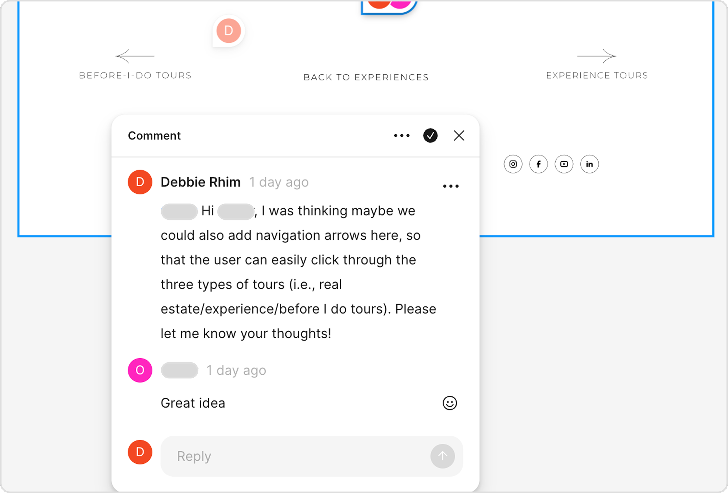
Sketching, clicking, and tweaking: real-time feedback in action
Evolving Core Experiences
Designing this website was all about making luxury feel effortless and intuitive for the user. Every page went through testing, tweaking, and iteration to balance elegance with clarity.
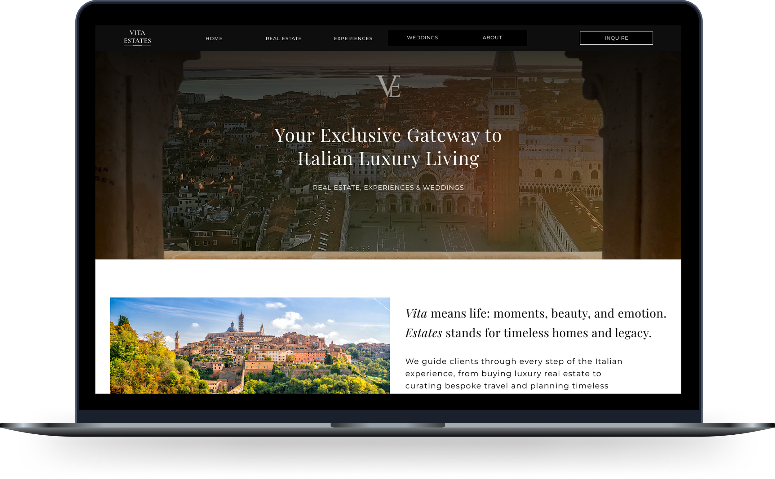
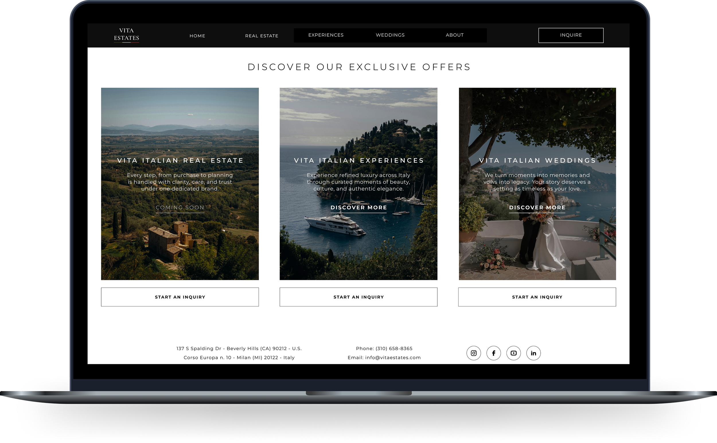
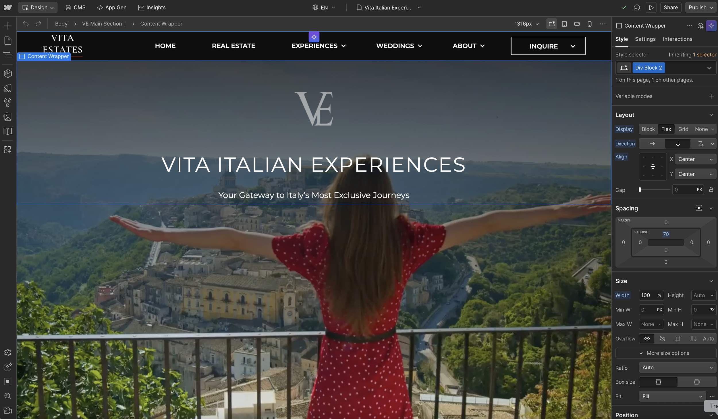
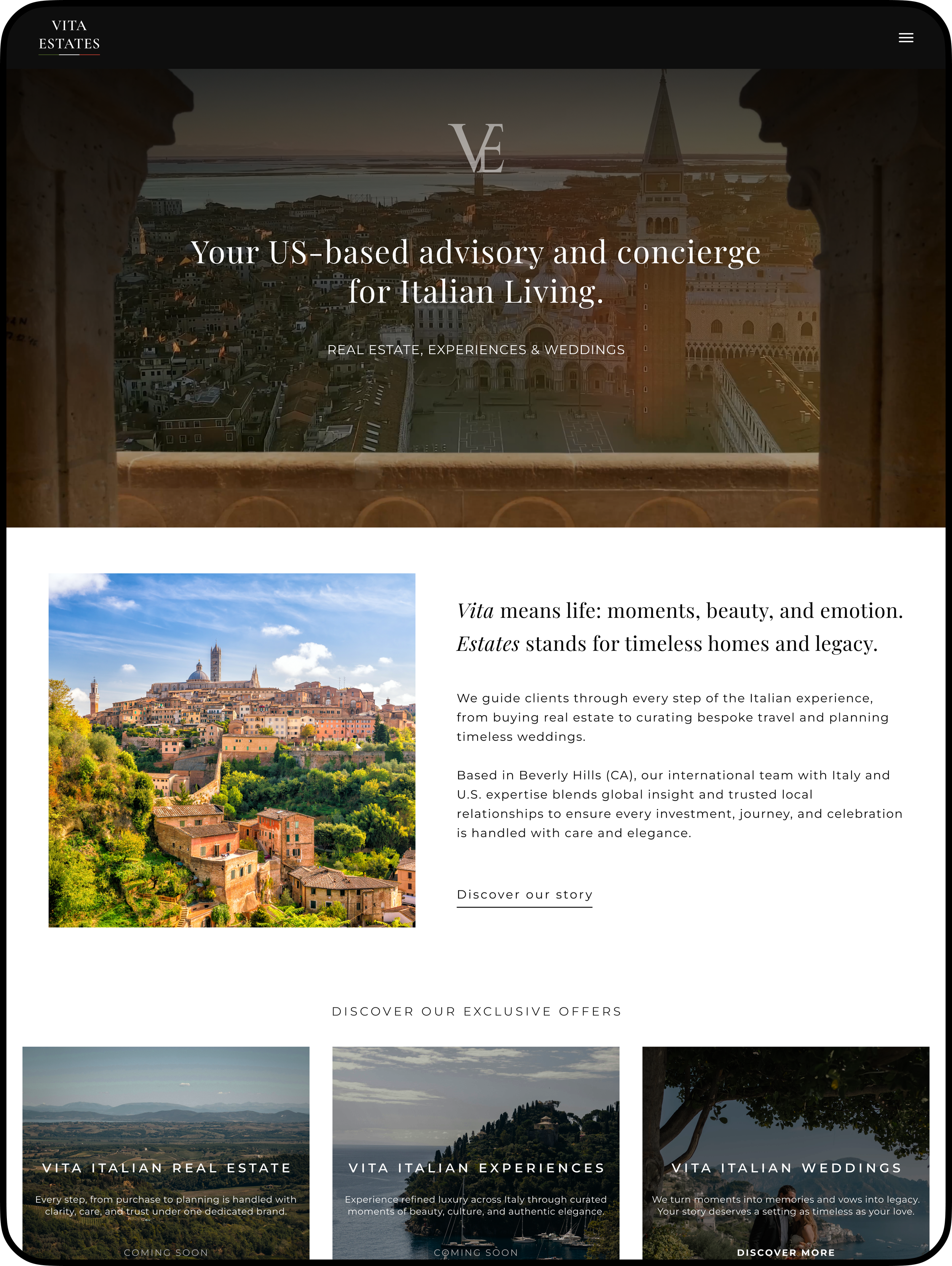
Home Page
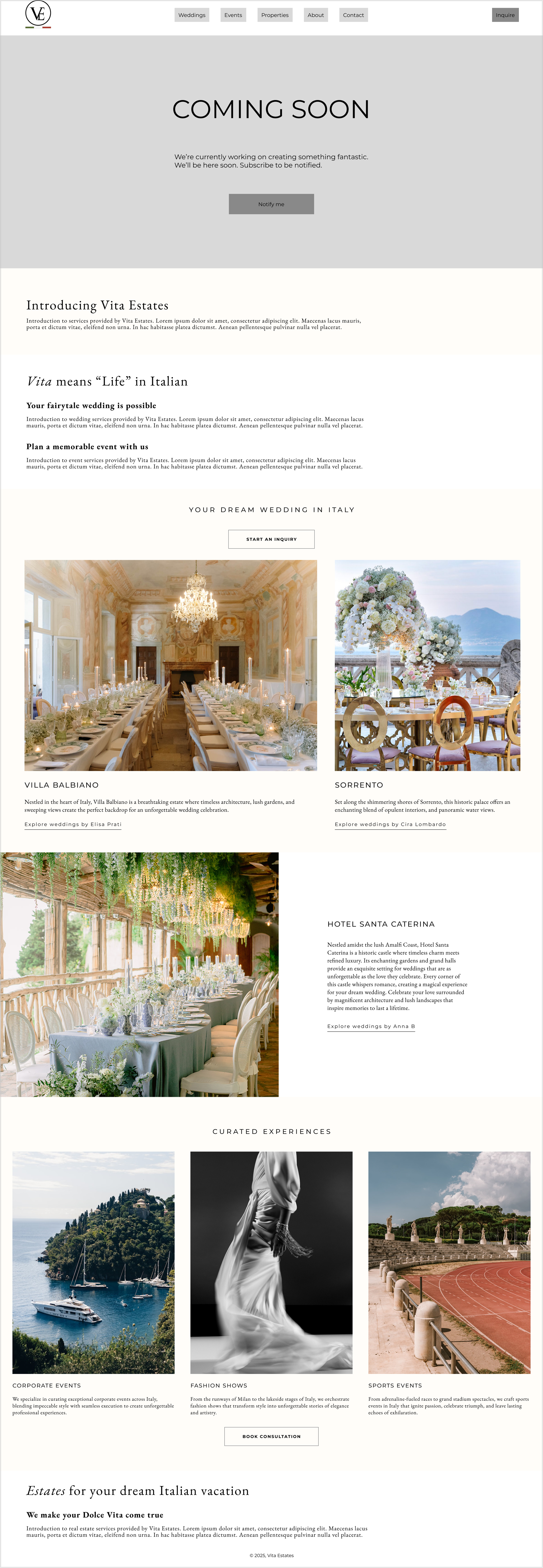
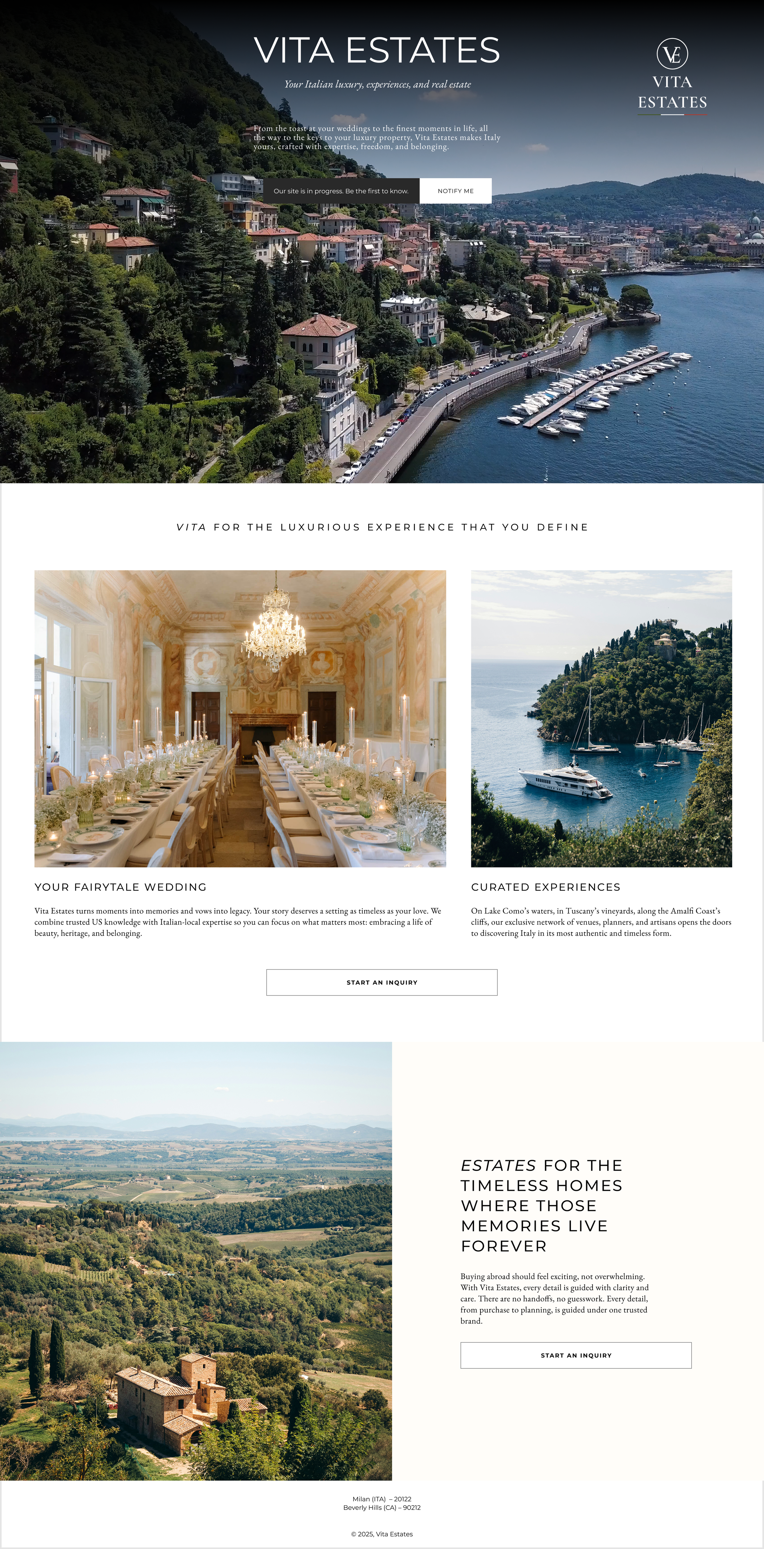
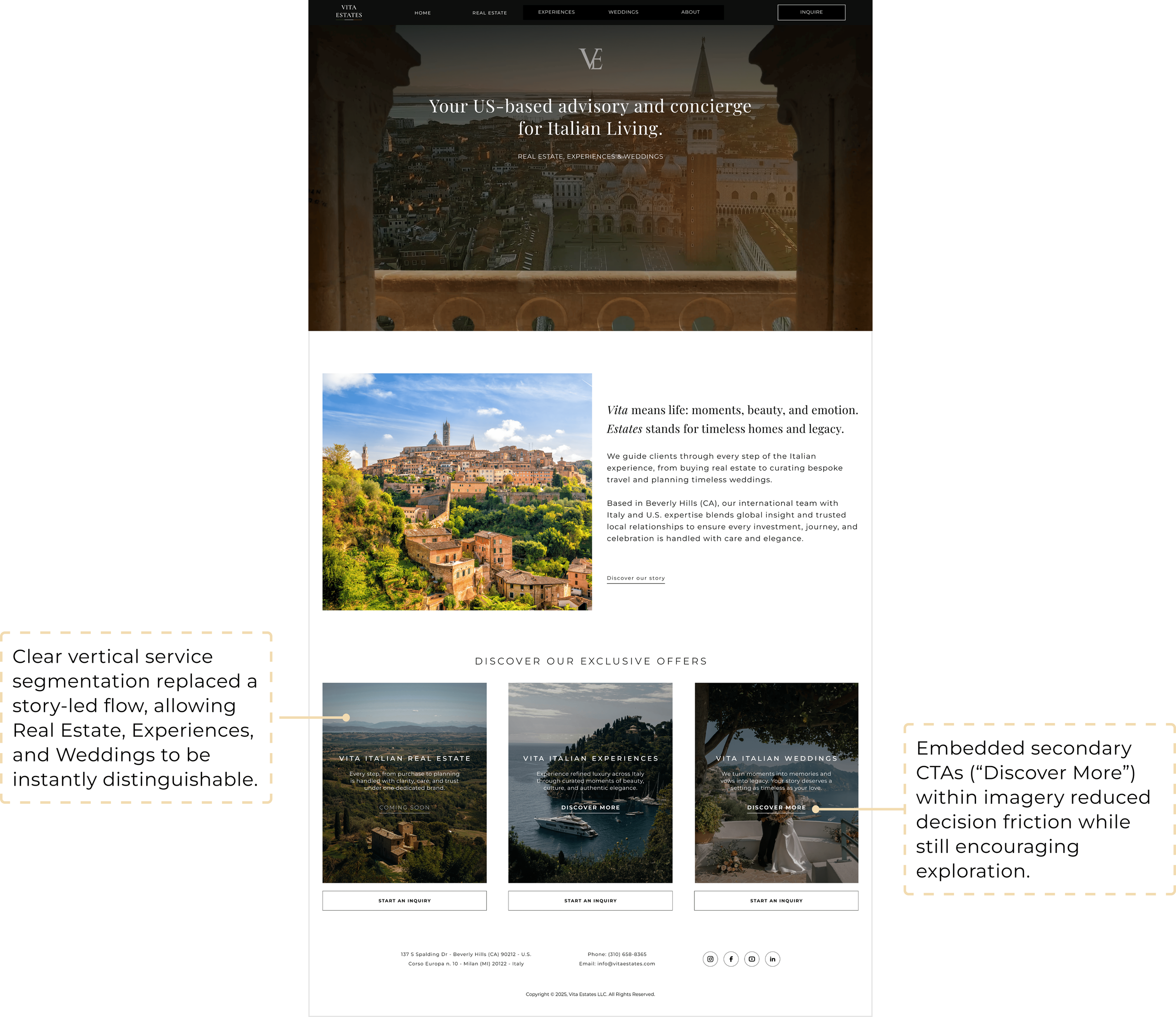
Problem: Users were confused by the initial grouping of services under “VITA” and “ESTATES.” The conceptual elegance didn’t match real user expectations.
Iteration 1 – Services were split into three clear sections: weddings, travel concierge, and real estate
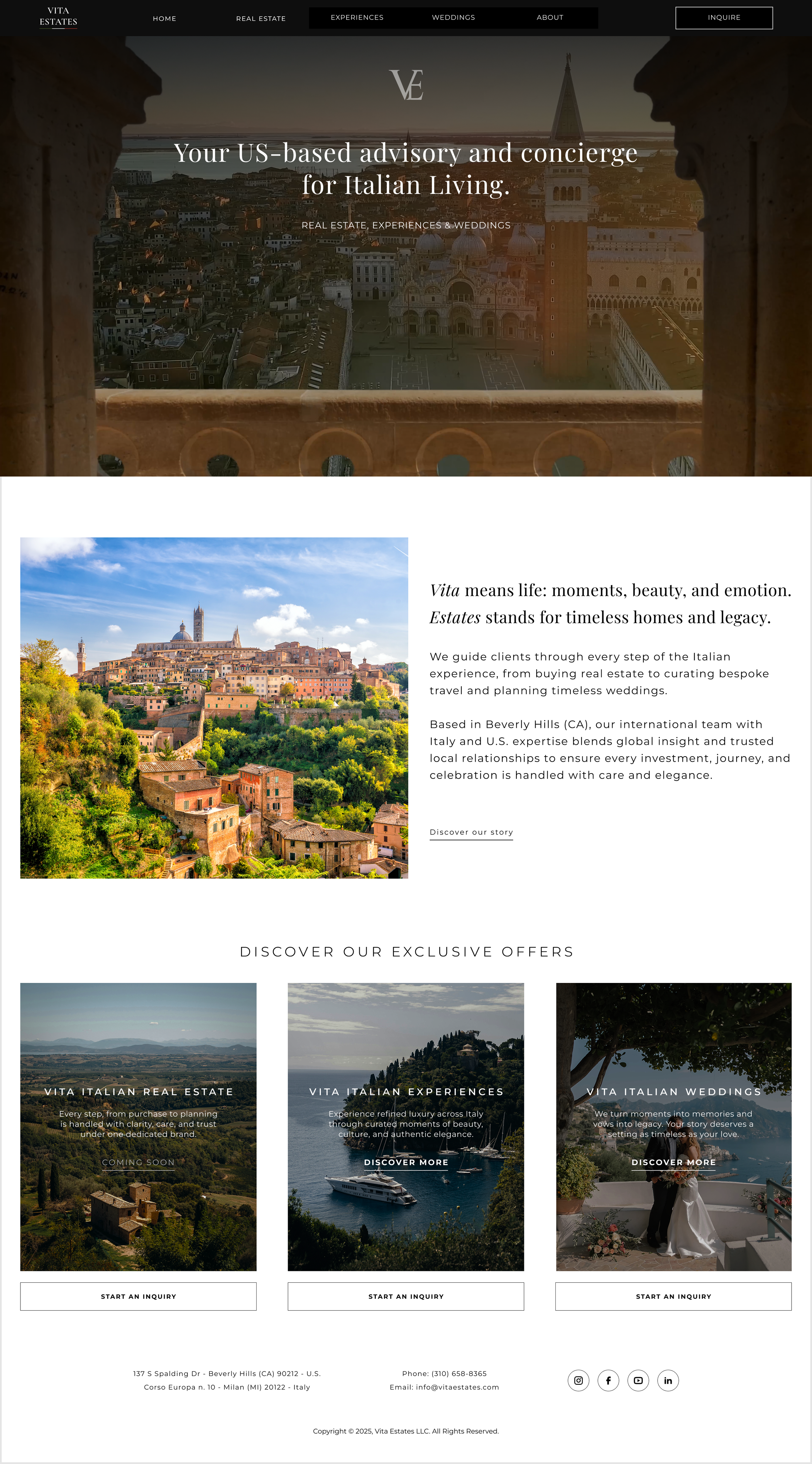
Iteration 2 – A subtle “Discover More” button was embedded inside images, encouraging exploration without clutter
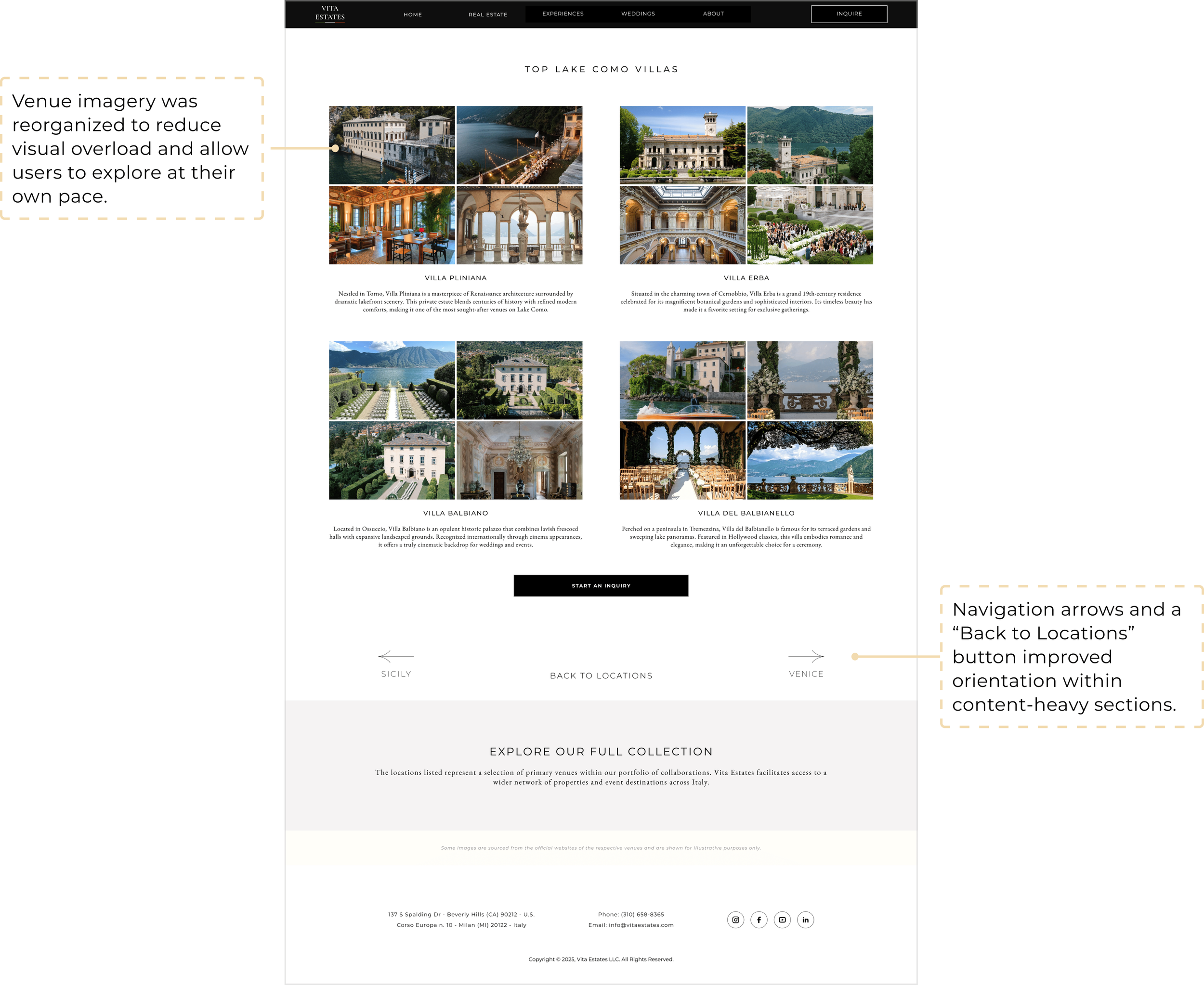
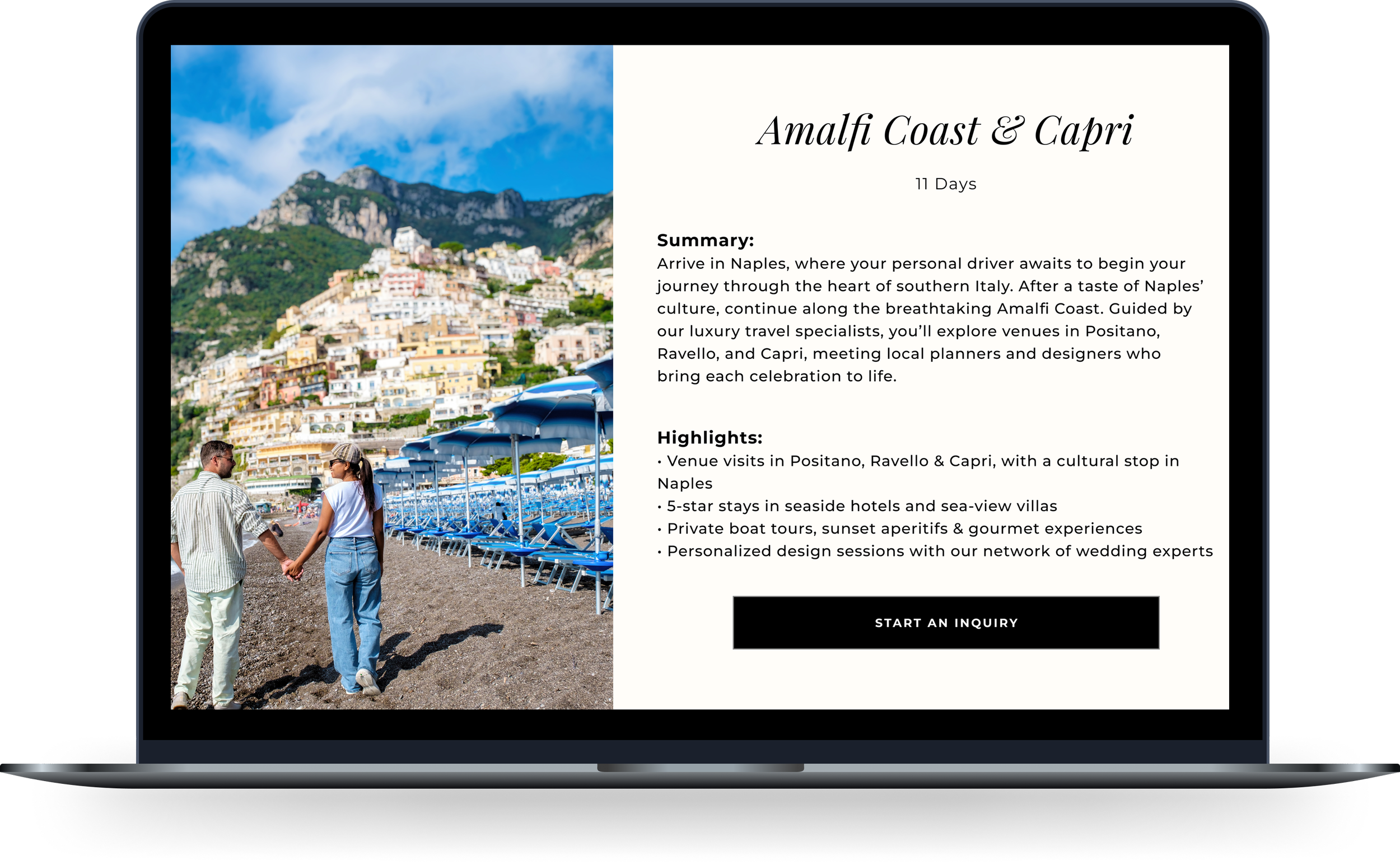
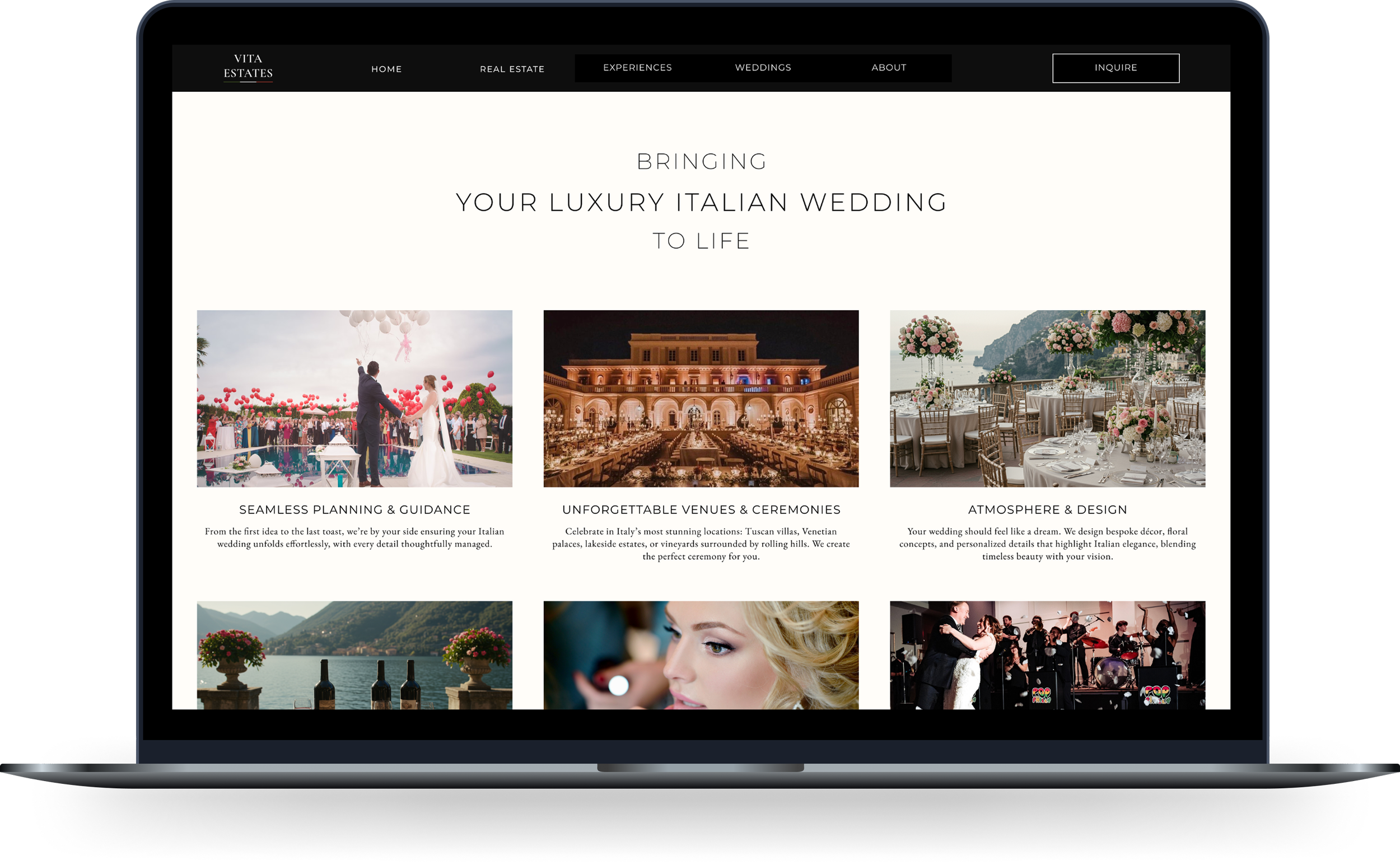
Wedding Pages
Problem: These content-rich pages needed to inspire without overwhelming users.
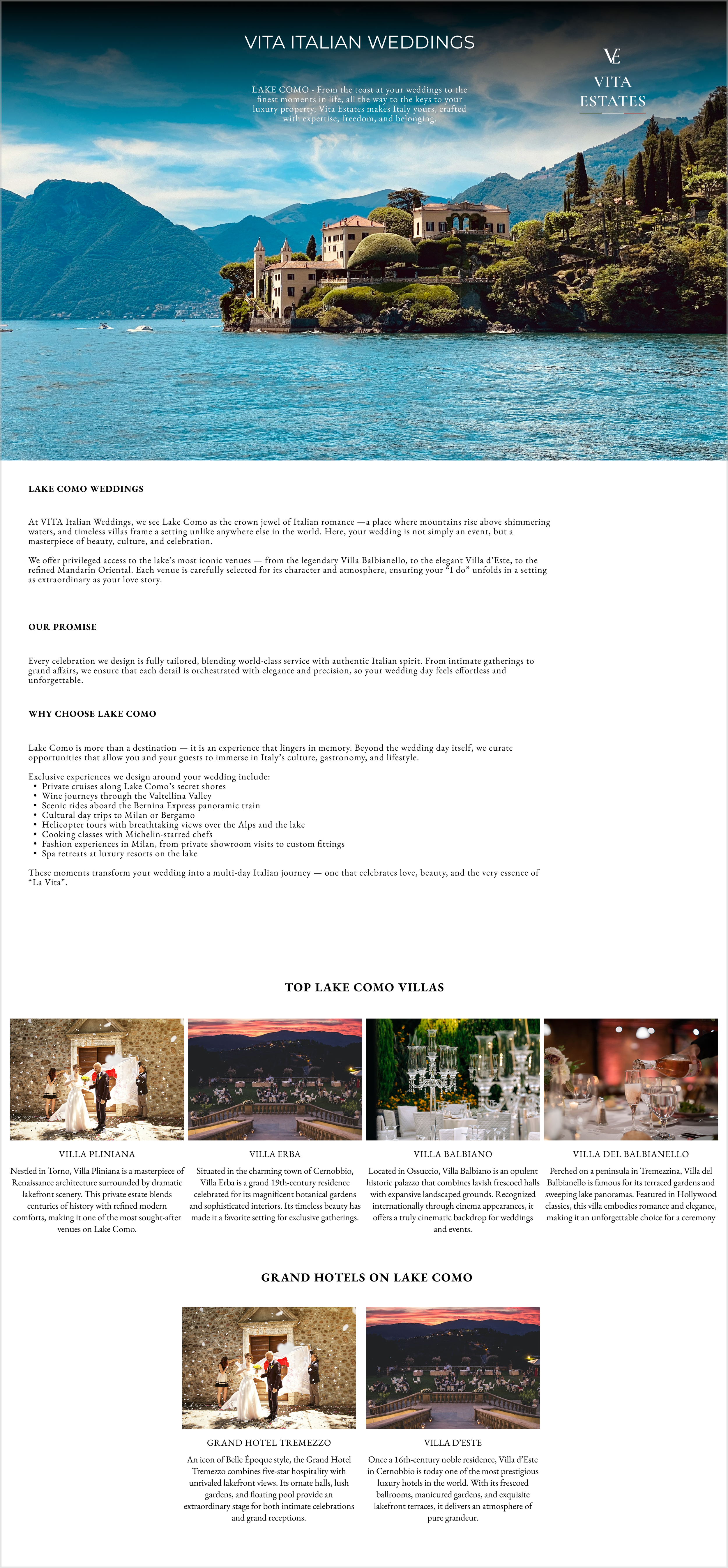
Iteration 1 - Hero image, wedding services, and “Explore by Location” introduced Italian destinations
Iteration 2 - We improved the balance of text and images to create a clearer narrative
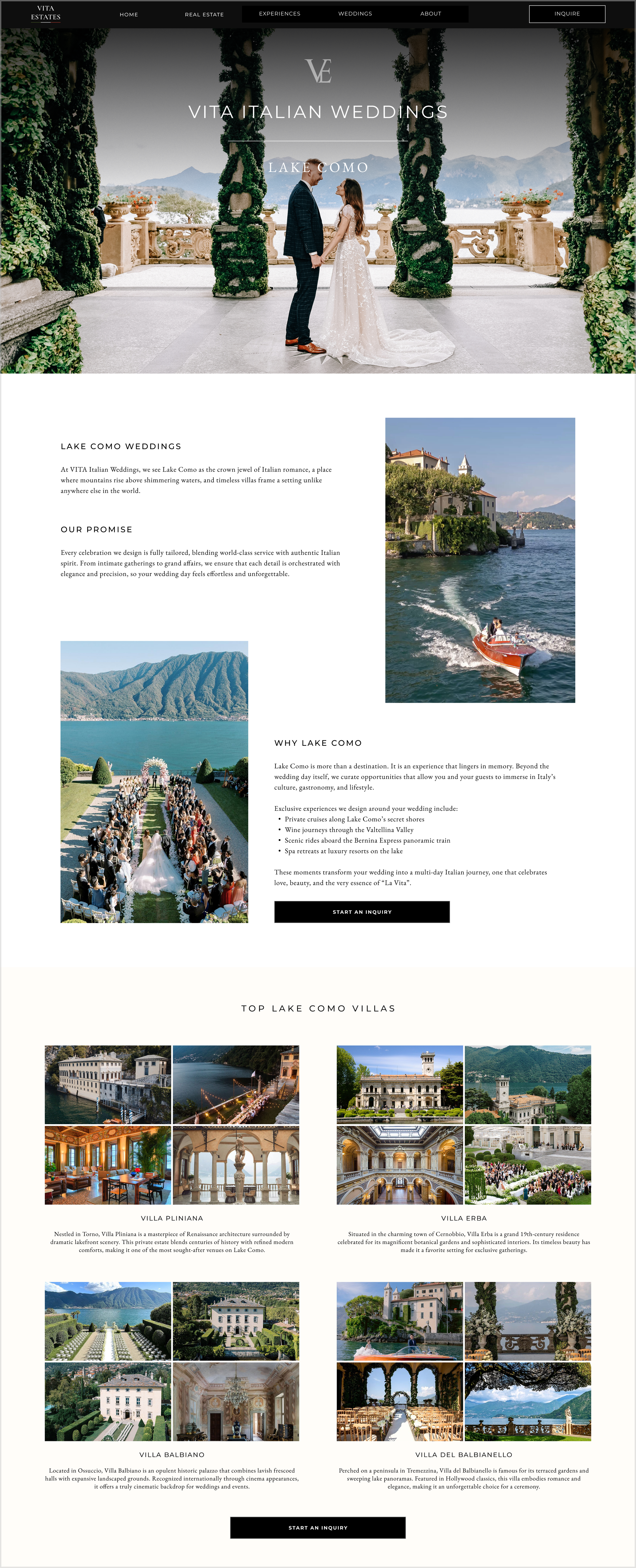
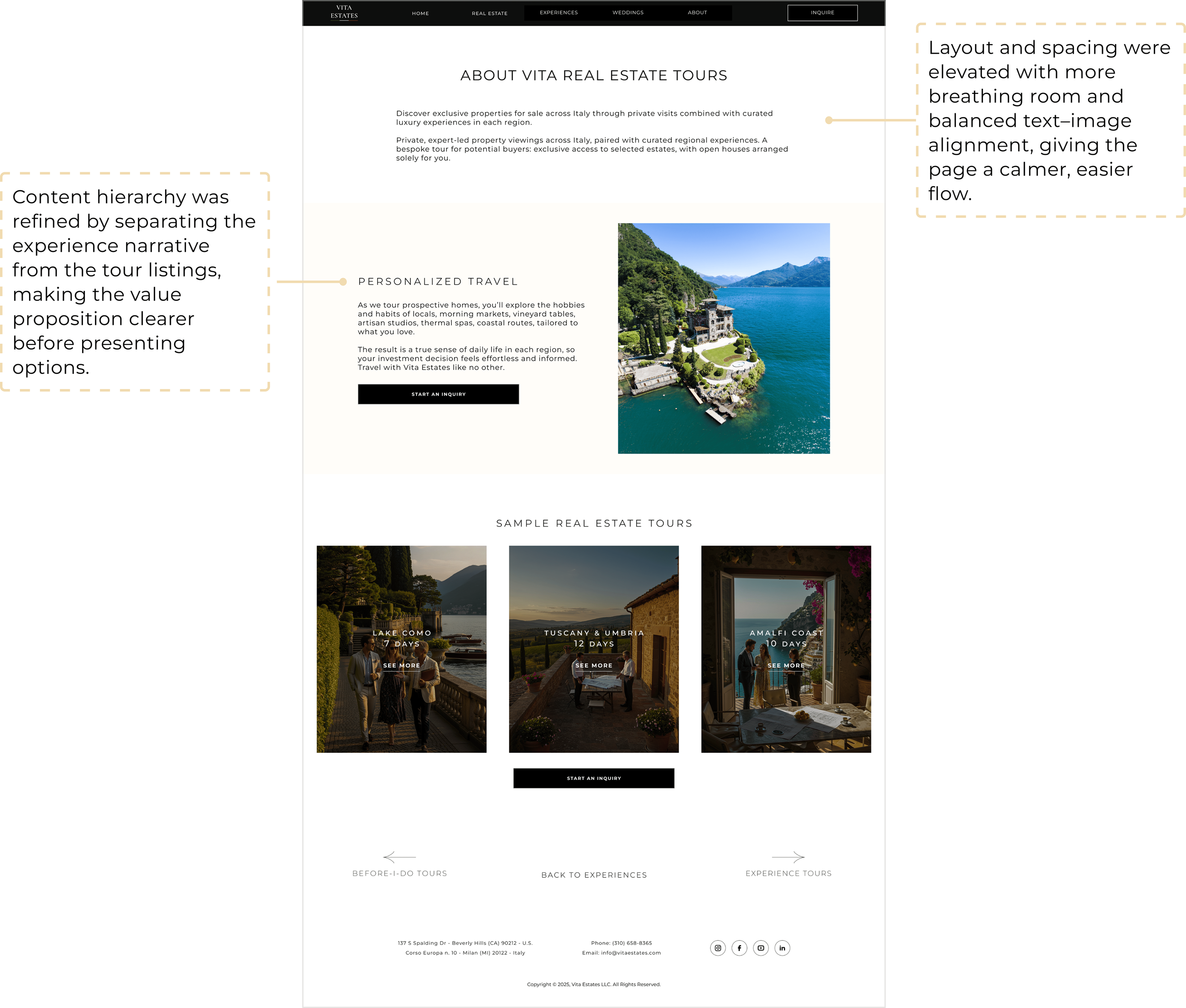
Experience Pages
Problem: Users needed to quickly understand the types of experiences offered without scrolling through extra content.
Iteration 1 - We highlighted the three travel experiences side by side
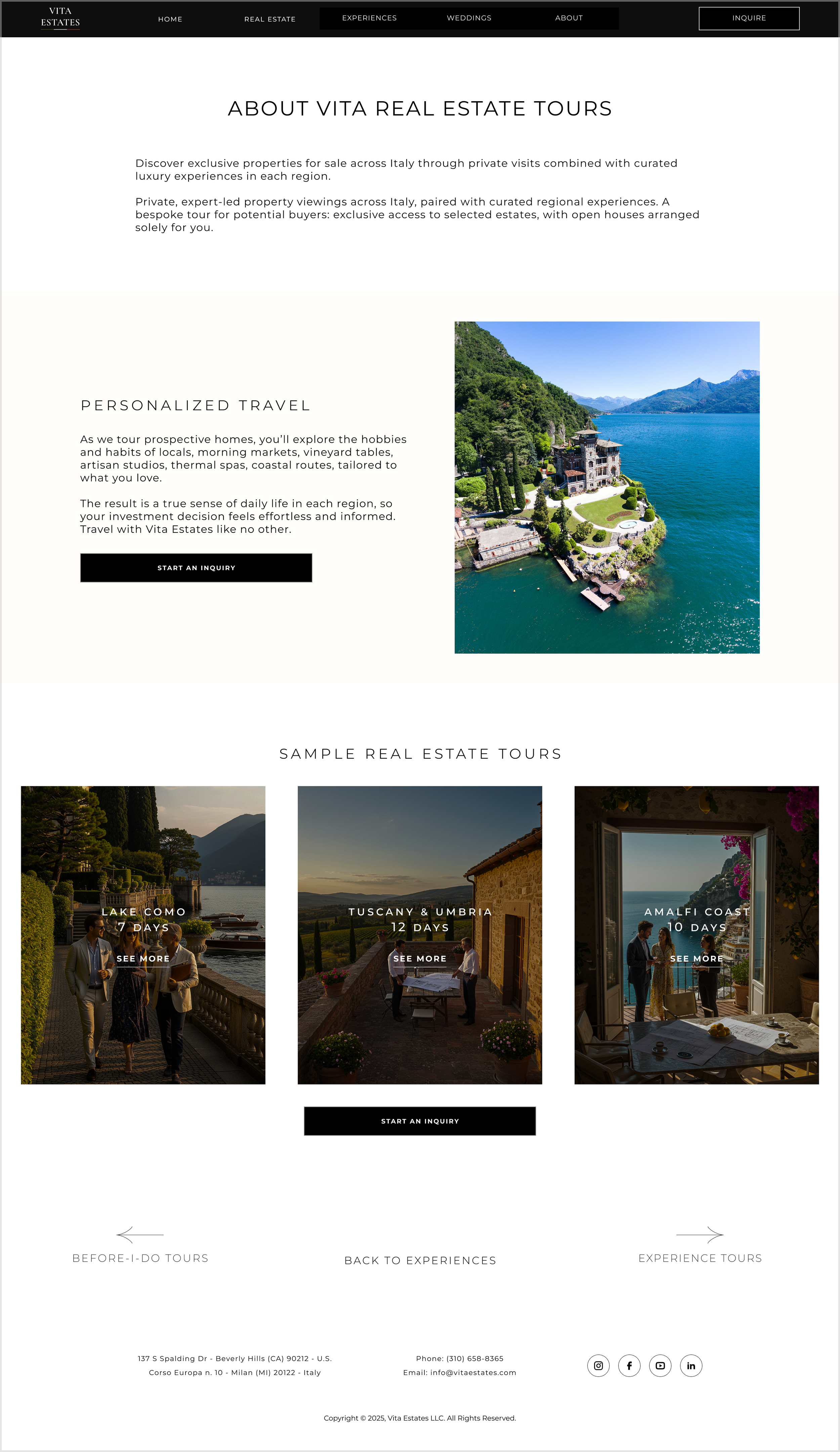
Iteration 2 - Tweaks to spacing between text and images kept the experience easy to scan
Decisions That Drove Results
Behind every scroll, click, and layout was a design decision that shaped the experience. Here’s a closer look at the choices we made and the results they delivered.
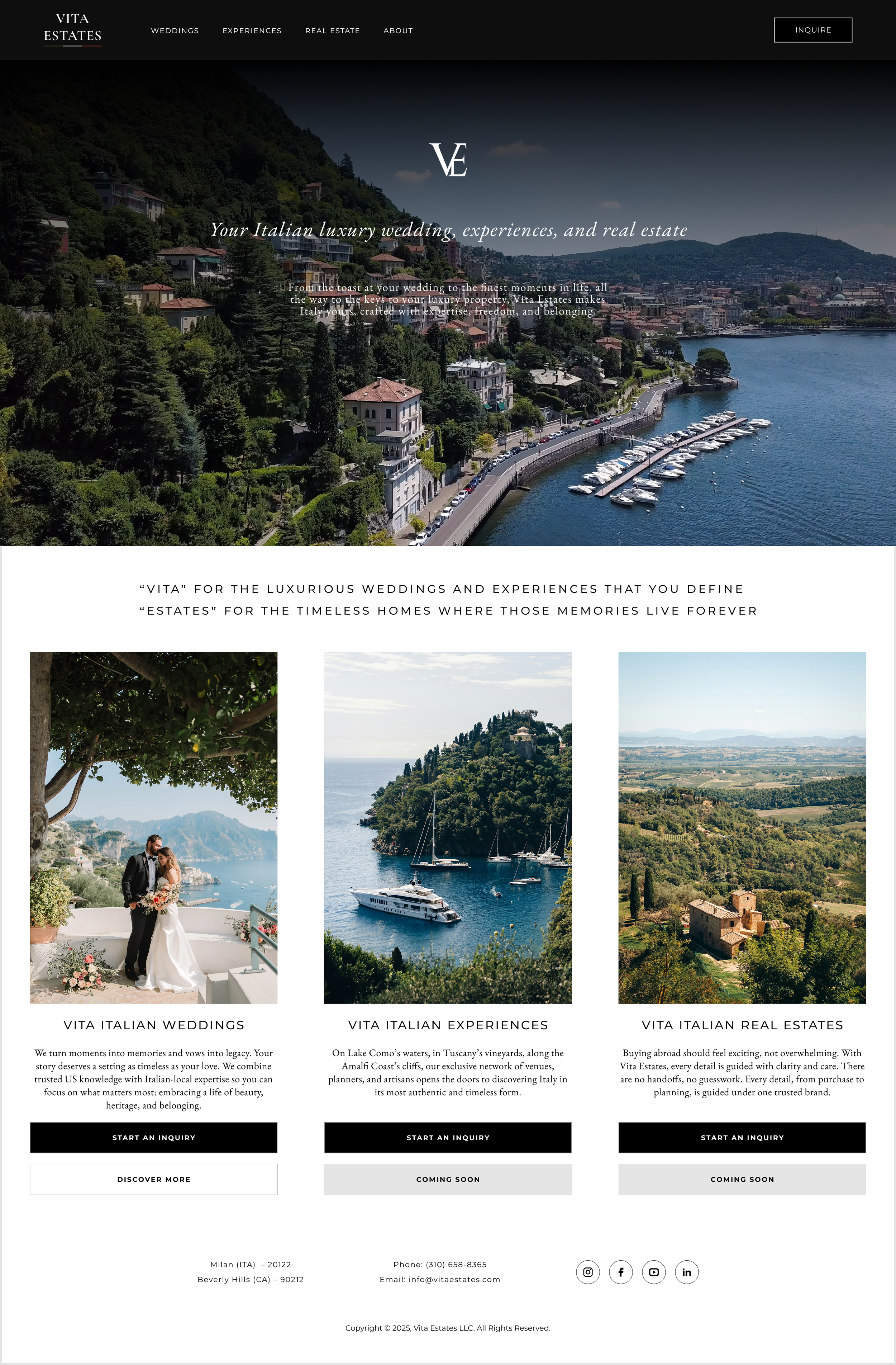
Home Page
Outcome: Users could immediately identify their service of interest and engage with it confidently, improving clarity, navigation efficiency, and early-stage conversion.
Wedding Pages
Outcome: Users could navigate content-rich pages without frustration while still feeling inspired.
Experience Pages
Outcome: The experiences page feels more intentional and guided, helping users understand why the tours matter before choosing which tour to explore, improving clarity and engagement.
Cross-Page UX Lessons
Consistency is important, but context matters: each page adapts to its content and audience.
Giving users control enhances luxury. Selective exploration feels premium and empowering.
Less is more. Clear hierarchy, spacing, and intentional CTAs communicate quality better than visual overload.
From Design to Launch
Design Handoff
I cooperated closely with two developers, creating an information framework to communicate the structure and functionality. Together, we assessed feasibility for migrating designs from Figma to Webflow, refining solutions as needed.
Before each handoff, I explained every frame, component, and interaction, and after the migration, I conducted thorough checks to ensure the implementation perfectly matched the designs.
Migrated Figma designs to Webflow in collaboration with developers
The Delivered Experience
Final Product
Successfully launched first version of the Vita Estates platform with:
Home, inquiry, About Us, Wedding, and Experiences pages
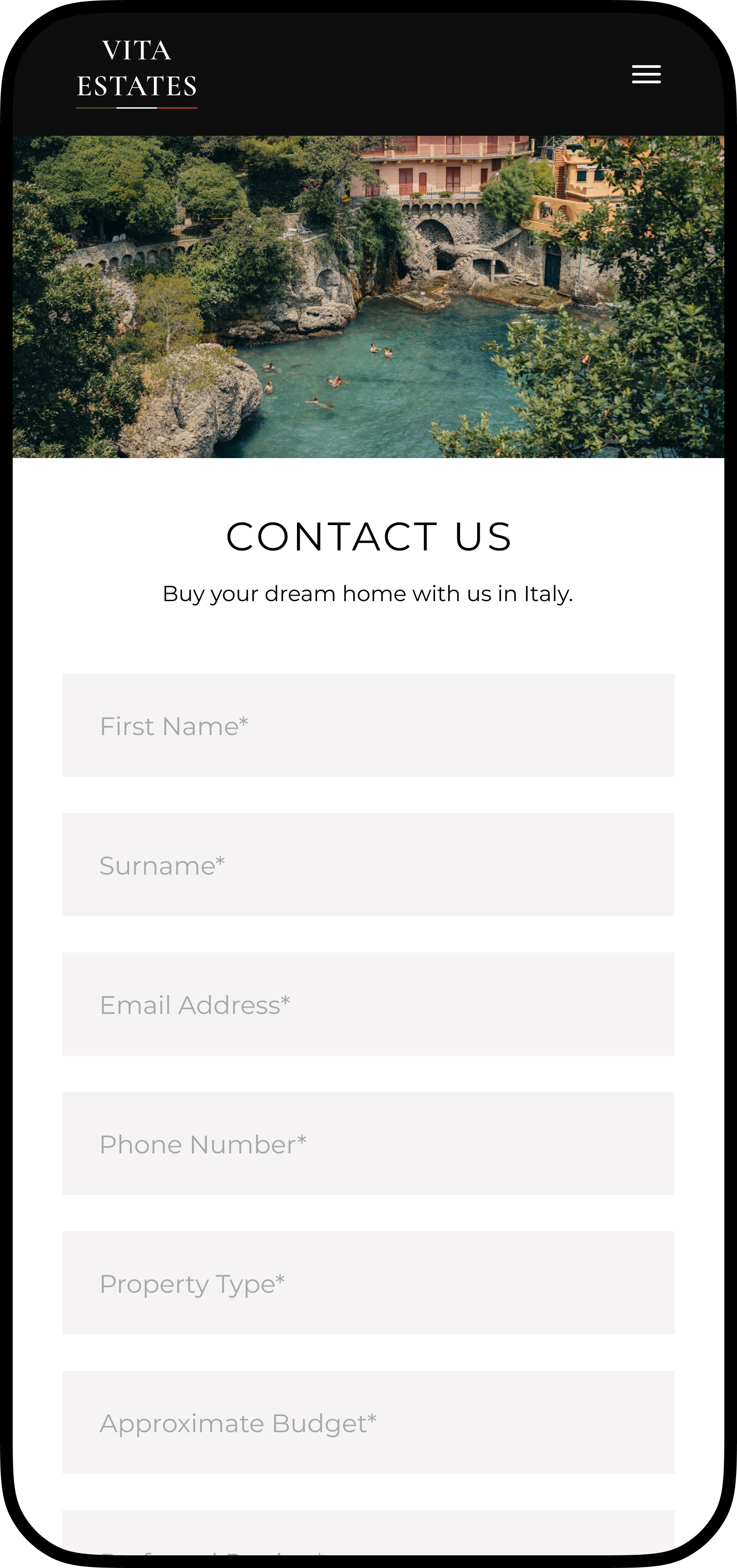
Fully responsive design: I prepared mobile and tablet responsive frames to ensure hierarchy, imagery, and CTAs worked seamlessly across devices, maintaining a consistent luxury experience.
Cohesive visual identity and first design system
The real estate pages weren’t started, but the responsive frameworks and design patterns from the home, wedding, and experiences pages provide a strong foundation for them.
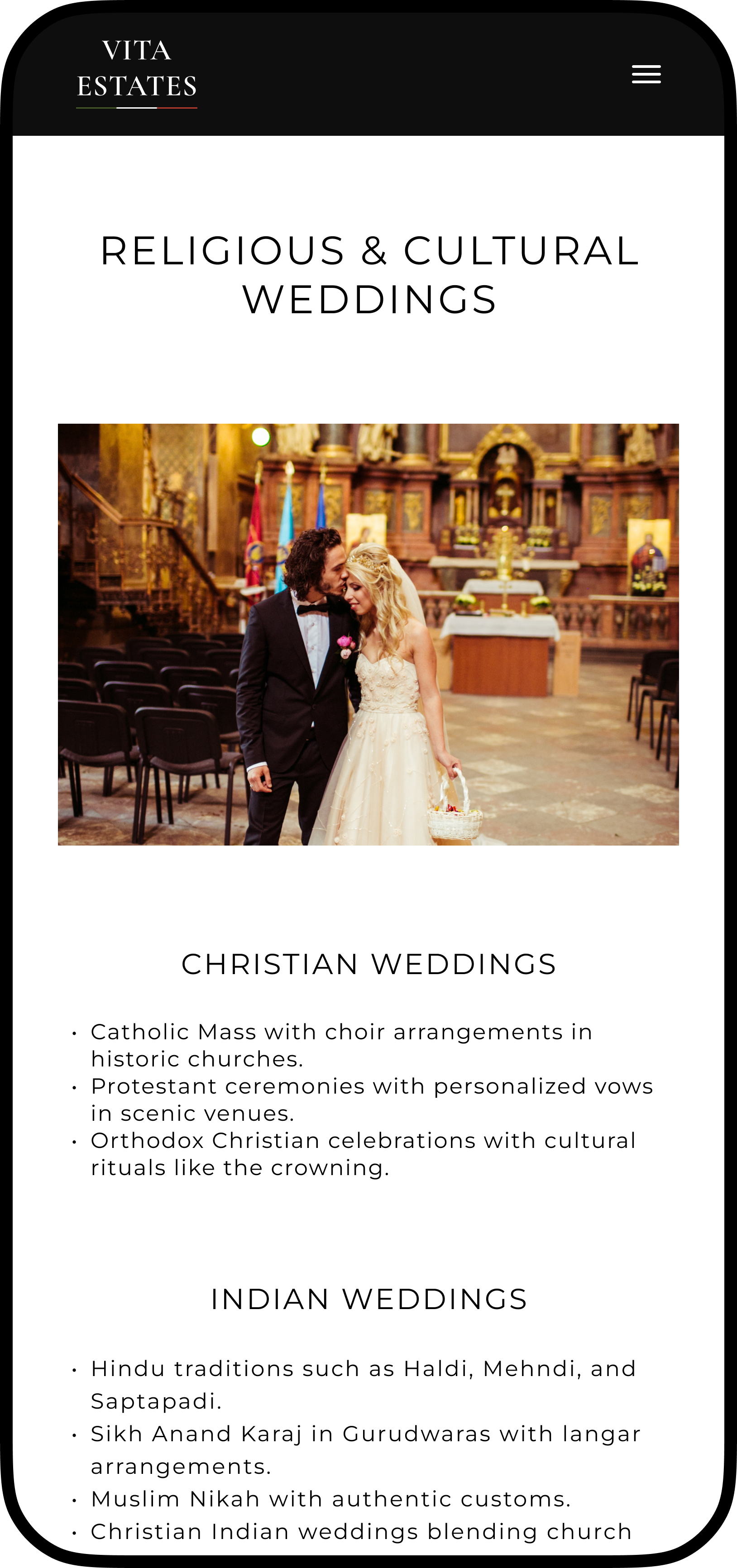
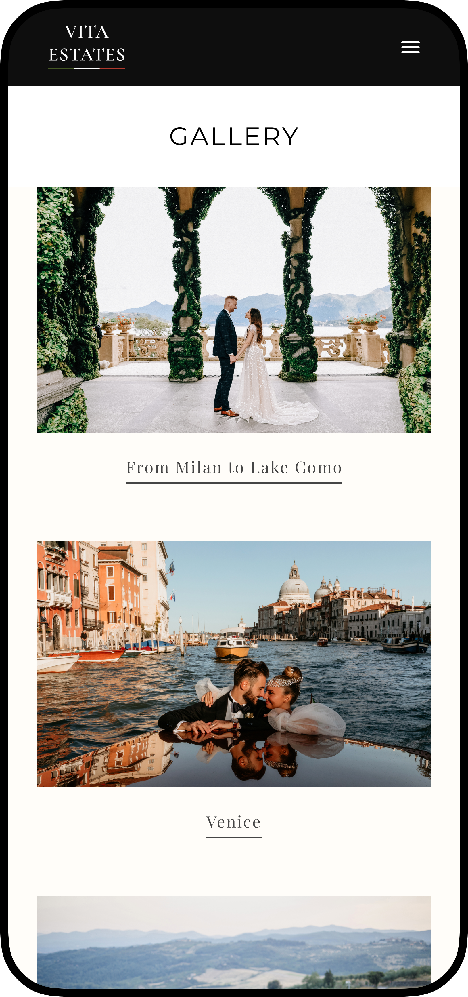
Mobile-friendly layout for clear, intuitive use
Tablet-responsive layout ensuring cross-device usability
Design System
I crafted a modern, premium visual identity for Vita Estates’ luxury website, blending contemporary design trends with the brand’s Italian allure.
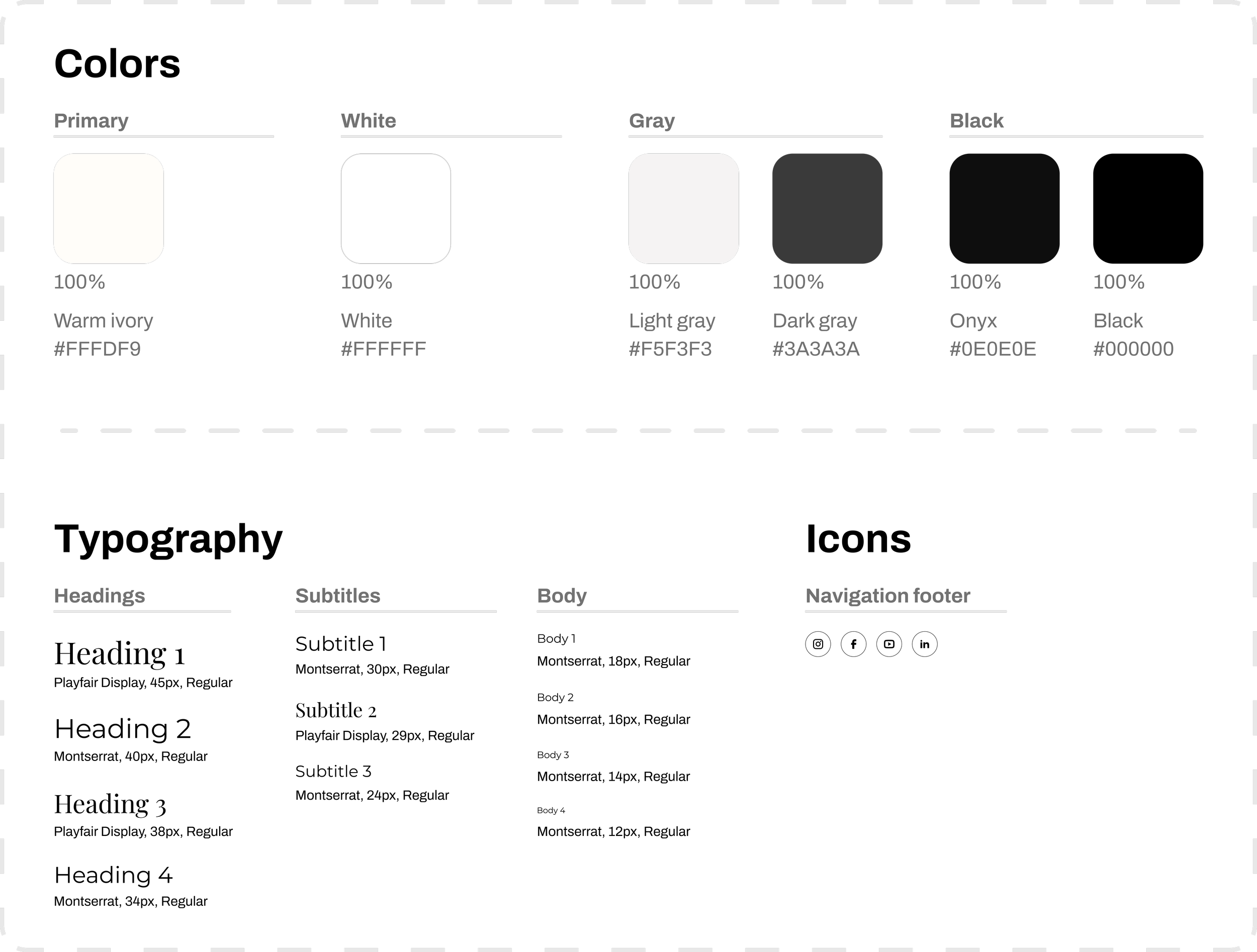
Black and white palette for luxury, with ivory accents for highlights
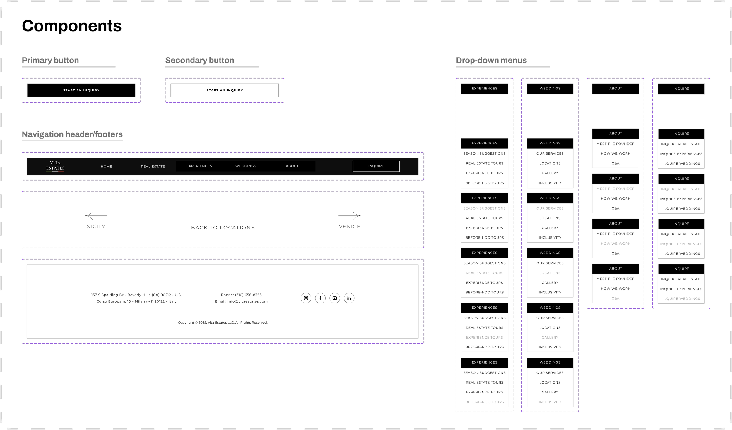
Headers, footers, and menus designed for intuitive navigation
Key Insights
Working on my first real-world project, I navigated complex challenges and discovered key lessons in balancing design, business priorities, and collaboration.
Challenge #1: Negotiating UX and stakeholder priorities
Balancing user needs and stakeholder goals sparked intuitive, business-savvy design solutions.
Challenge #2: Balancing luxury aesthetics and usability
Making the platform feel luxurious without sacrificing usability was tricky. Through iterative testing, I refined the experience so it looks stunning while still being effortless to use.
Challenge #3: Facilitating developer collaboration
Keeping design and development in sync required constant coordination. I worked closely with developers to ensure every detail was feasible for high-fidelity migration.
Final Reflection
What I Learned
The experience clarified how I can take stronger ownership of design direction while continuing to grow as a strategic and collaborative designer by:
Proposing stronger initial concepts and structures before heavy stakeholder input to establish a clear foundation for iterations.
Balancing business goals with user-friendly design by presenting clear rationale and evidence for key choices.
Looking ahead, I’m ready to design experiences that are intuitive and genuinely delightful: keeping users happy while driving business forward, one thoughtful interaction at a time.