
The Cheese Store of Beverly Hills
Bringing the charm of the cheese counter to your screen.


Role
Lead UX/UI Designer
Tool
Figma
Project Duration
Context
1 Month
Gourmet foods and artisanal cheeses have traditionally been bought in-store. But the gourmet experience has been rapidly evolving in recent years, influenced by the shift from offline to online shopping.
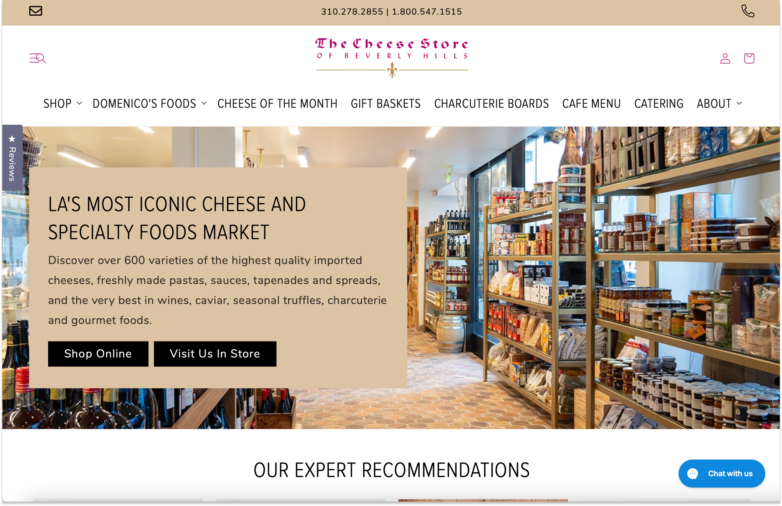
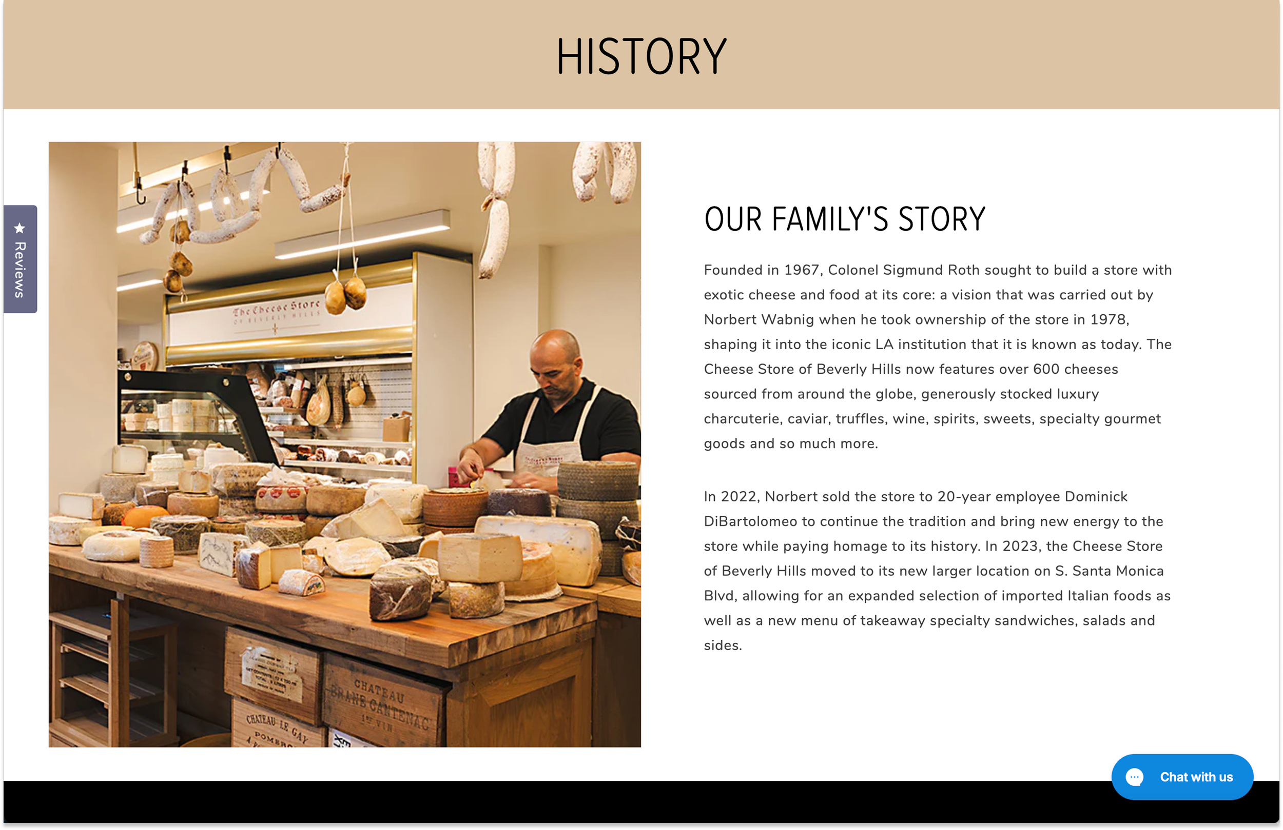
One of the exceptional gourmet food stores is The Cheese Store of Beverly Hills, a Los Angeles staple since 1967.
As a loyal customer myself, I took the initiative to redesign the site with one guiding question: How can I bring the warmth and delight of the in-store experience to the online journey?
Responsibilities
User Research, Paper and Digital Wireframing, Low and High-Fidelity Prototyping, Usability Studies
Project Overview
Goal
It was essential to address user pain points, particularly the difficulty of finding specific products or services.
The main goal became clear: to simplify the browsing process and encourage more users to complete their orders online.
Solution
I redesigned the website for The Cheese Store of Beverly Hills to better support the online sale and promotion of gourmet foods and cheeses for pickup and delivery.
The new design simplifies navigation with an intuitive interface, making it easy for both individual enthusiasts and catering customers to place online orders and discover the products they love.
Problem Statement
The client’s website has an unclear navigation structure, including inconsistent information architecture and a multi-step click journey, making it difficult for users to easily find products and complete purchases.
Design Process
I followed a standard design process, beginning with user research. Through conducting in-person user interviews and online qualitative research, I identified common pain points in the current user experience.
With these findings, I moved into ideation, starting with paper sketches and refining concepts through multiple iterations to arrive at a high-fidelity prototype for the website redesign.
Then, I conducted usability testing, and based on the results, I made final improvements to ensure the most optimal user experience.

1. Learning About the User
User Research
User Groups
The Cheese Store is a beloved Los Angeles gem with a strong nationwide reputation for satisfying gourmet enthusiasts.
To thoroughly understand the target consumer groups, I conducted in-person user interviews, as well as an in-depth analysis of online reviews from food lovers drawn to the store’s high-quality selection of artisanal cheeses, wines, specialty foods, and catering services.
After analyzing the results from user research, I found that the main consumer base consists of:
Online customers – This group includes both those who have visited the store and those who haven’t. They typically shop for specific products of interest or subscribe to monthly cheese selection deliveries.
Local customers – Those who order local deliveries and pickups for meals or catering.
To comprehensively understand the average user experience, I conducted a competitive analysis on the websites of three major California-based businesses specializing in gourmet foods/cheeses: Say Cheese, Andrew’s Cheese Shop and La Fromagerie.
Questions that guided the analysis:
How do users typically discover new gourmet foods/cheeses to buy online?
What information do users look for before purchasing gourmet foods/cheeses?
What factors influence users to purchase gourmet foods/cheeses online instead of in-store?
Do users prefer a guided shopping experience or to freely browse?
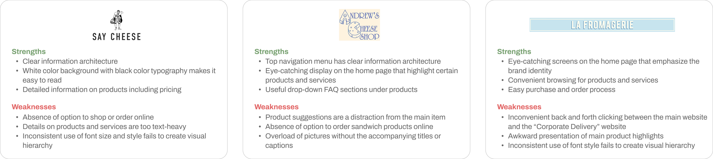
Discoveries from the analysis:
Shipping options matter: Organizing product categories based on delivery or pickup availability makes shopping more convenient. (La Fromagerie)
Visual hierarchy should be clear: Highlighting certain products or services helps users easily differentiate content. (La Fromagerie, Andrew’s Cheese Shop)
Content presentation should be balanced: A mix of text details and images with captions enhances the online shopping experience. (Say Cheese, Andrew’s Cheese Shop)
Limited online ordering hinders user journey: Some businesses do not offer online ordering for certain products. (Say Cheese, Andrew’s Cheese Shop)
Competitive Analysis
2. Tackling the Challenges
Cross-functional Efforts
Pain Points
I identified that the following challenges need to be addressed with The Cheese Store’s website:
Confusing information architecture, particularly the navigation menu comprised of inconsistent category labels
Unclear shipping options for different product/service categories
Too many steps for basic actions like browsing and ordering
Proposed Solutions
Re-stacking Categories
Even though this project was self-directed, I approached it as if it involved real-life teamwork. For example, I envisioned working with business operations to rethink the website categories - grouping products according to shipping options in a way that feels natural and inviting for shoppers.
I would collaborate closely with developers from the start to ensure features like real-time stock updates and personalized product recommendations run smoothly behind the scenes.
Additionally, I would partner with marketing and sales teams to highlight any seasonal treats, making sure that every visitor from curious newcomers to passionate food lovers can quickly find exactly what they are craving.
To solve the identified issues, I brainstormed the following solutions:
Group similar products together by recategorizing navigation menu items
Add clear sections in the home page to direct users to shop online, order from the café menu, or request catering
Differentiate local pickup and delivery items from online-only products by creating dedicated pages for the café and catering menus
Highlight “Cheese of the Month” with a standalone page to give more visibility as a special feature
The layout of the website is confusing mainly because products with different shipping options - like local pickup, local delivery, and nationwide shipping - are scattered across various tabs and often overlapping with each other.
To fix this, I started by creating a table to categorize the products based on their shipping options. This process helped clarify which products belonged where.

3. Building the Framework
Paper Sketches
Low-fidelity Wireframes
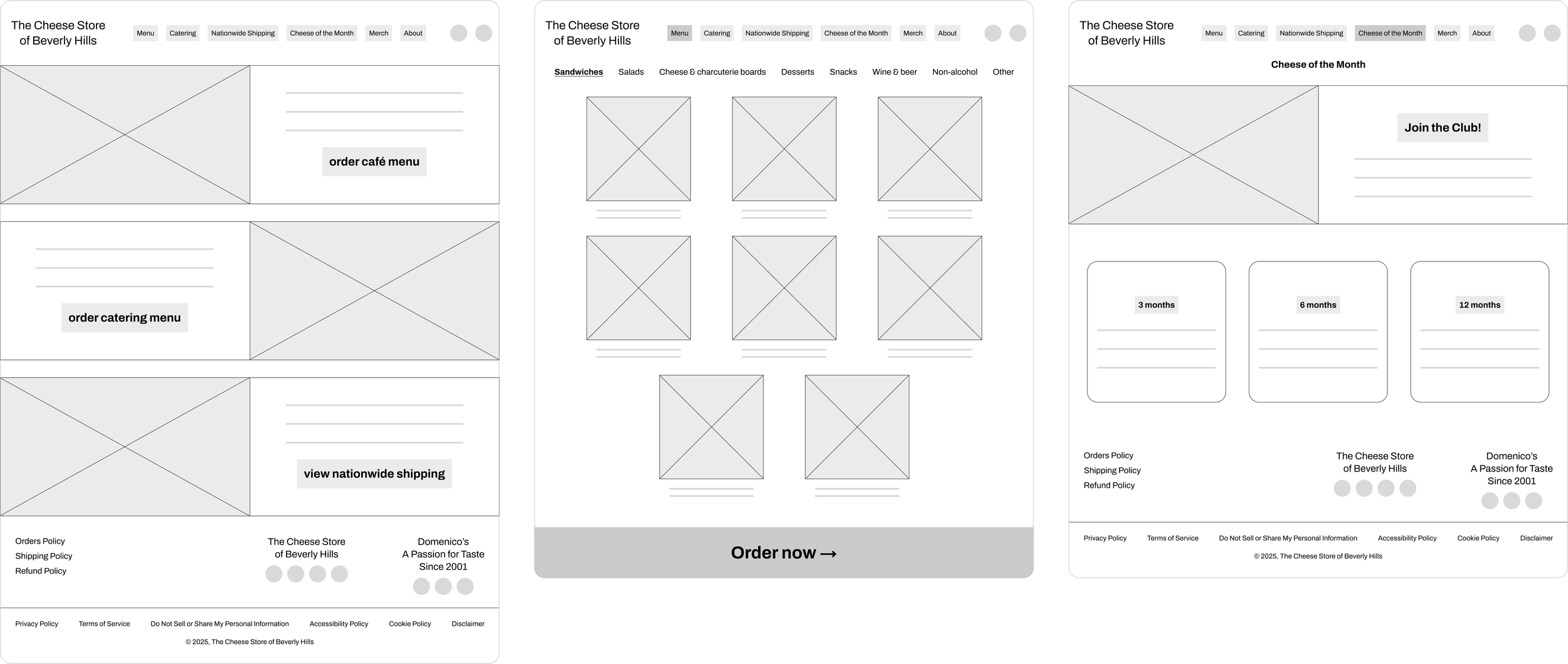
Based on the analysis above, I created rough paper sketches of the home page to explore possible solutions and improvements. Here are some of the initial sketches of the home page, café menu page, Cheese of the Month page, and about page.

Next, I drafted low-fidelity digital wireframes to gather feedback on the layout and structure of the design.
My main goal was to build a well-organized information structure across all pages. I wanted to make it easy for users to navigate and find the products they were interested in. To achieve this, I focused on a clear visual hierarchy and a consistent layout, for example, as follows.
Usability Study
I conducted user testing at each key stage of the project to uncover major pain points in the current version.
After gathering feedback, I refined the prototypes and continued testing to validate improvements. Specifically, I realized that the top navigation menu could be even more simplified according to online shopping, café menu ordering and catering menu ordering.
Further, it was more consistent to group the “Cheese of the Month” page under the general category of online shopping.
4. Bringing the Design to Life
Challenge:
Users experience confusion starting with the top navigation menu, which lacks clear distinctions between products. Products for nationwide shipping, local pickup, and delivery are presented inconsistently without clear guidance, forcing users to click through each tab to find what they want.
Design Decisions
#1: Intuitive Navigation for a Multi-Channel Experience
Challenge:
The product search page offers limited filtering options, displays only basic details (name and price), and lacks a direct “Add to cart” feature.

#2: Optimizing the Product Browsing Experience
Solution:
I enhanced the filtering options with key attributes (such as texture, milk type, flavor, country of origin, and shipping options) for more refined search results. I also added essential product details such as texture, milk type, country of origin on the listings and added an “Add to cart” button displayed on hover to make the purchasing process convenient.

Challenge:
The product detail page lacks clear readability due to inconsistent use of white space and presentation of the product description in a dense paragraph format. Further, suggestions for related products are listed without any emphasis on the visual hierarchy in relation to the main product.

#3: Clarity in Every Product Page
Solution:
I redesigned so that key product details, such as texture, milk type, and country of origin, are now summarized in an “In a Nutshell” section. Further, related product suggestions have been repositioned to be highlighted while not overshadowing the main item. Finally, shipping and pickup options are clearly displayed, and weight selections are consolidated into a dropdown menu.

Challenge:
The website relies on basic color blocks and uses too much white space, resulting in a dated appearance and difficult usability. Particularly, the bottom navigation section is cluttered , making it inconvenient for users to find the targeted information.
Solution:
I streamlined the navigation structure into three clear categories: “Shop” (nationwide shipping, local delivery, and pickup), “Café” (local delivery and pickup), and “Catering” (local delivery and pickup). I retained the “About” section for brand storytelling and emphasized the search bar for users with specific needs. Additionally, clicking “Café” or “Catering” now reveals full lists of menus for convenient review before starting the ordering process.

#4: From Cluttered to Cohesive
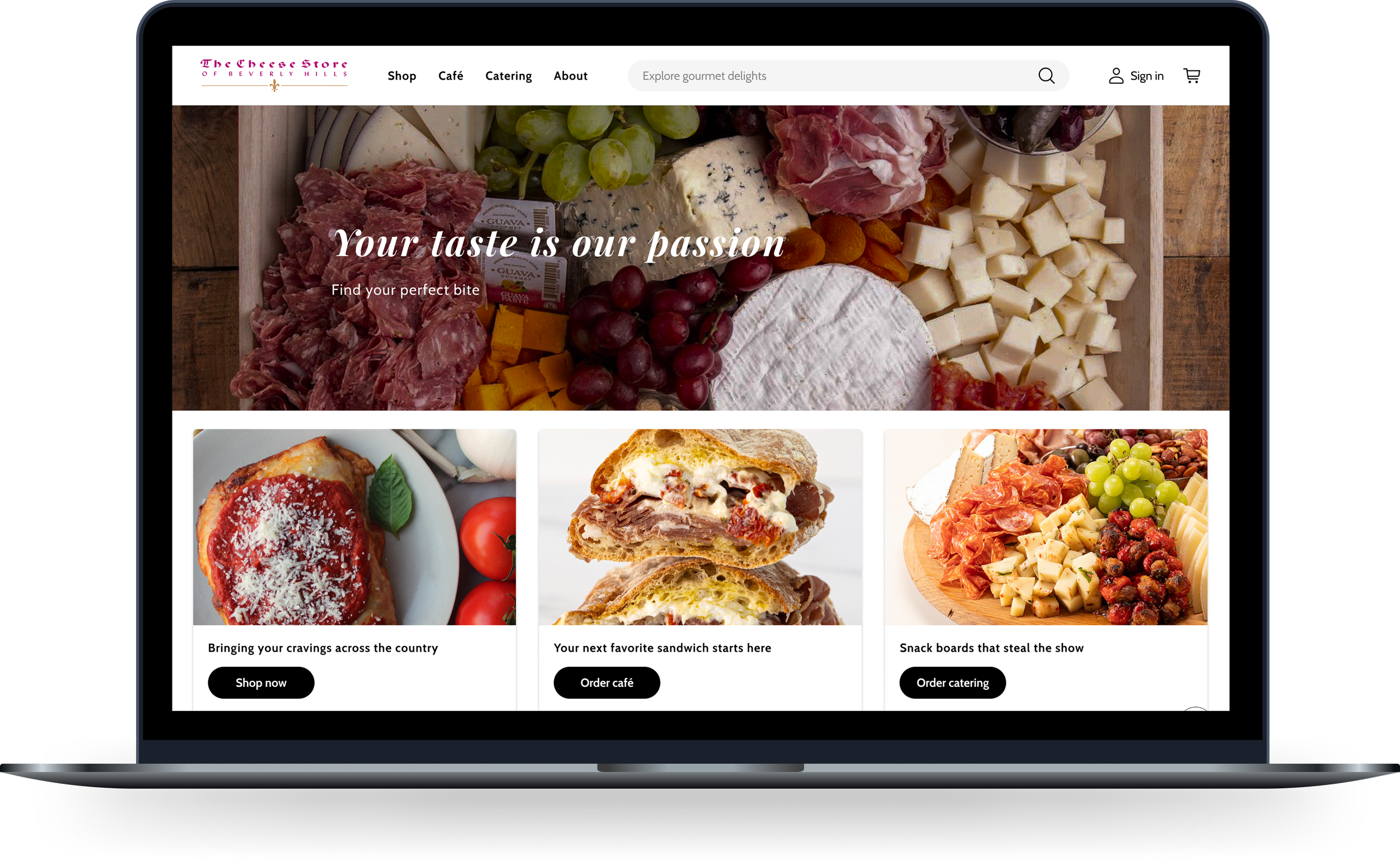
Building on research insights, I developed a clickable prototype featuring an easy interface complemented by a modern, new look to enhance the overall user experience.
Solution:
I redesigned with the goal to create a cohesive experience through improved color schemes, typography, and layout. I focused on enhancing readability, clarifying visual hierarchy, and streamlining navigation, especially in the bottom menu. Finally, I restructured the “About” page to present key sections like “Our Story,” “Book an Event,” and “Contact Us” in a single scroll.

Visual System
I aimed to craft a modern, premium visual identity for the client’s website that aligns with current design trends while preserving the brand’s artisanal character.


5. The Takeaway
From Browsers to Buyers
Final Insight
In the competitive online marketplace, where product choices are endless and customers are selective, standing out can be a challenge for businesses.
Now, with the revamp of The Cheese Store’s website into a more user-friendly space, it will help the client stand out and bring about the following business benefits:
Converting first-time visitors into buyers and encouraging repeat purchases by simplifying product discovery and transactions
Boosting average order value through personalized recommendations, encouraging purchases of complementary items like wine or crackers
Positioning the brand image as premium and in trend, which are key attributes in the specialty food market
Designing for this project was fascinating, particularly with the challenge of redefining the information architecture for services with overlapping features: online shopping, café orders and catering.
Some important lessons include the importance of engaging the client more frequently throughout the design process. This would have allowed for earlier incorporation of their feedback. Further, conducting more user interviews could have provided deeper insights into usability issues and their preferences.
In conclusion, this project was a great learning opportunity, teaching me how to juggle client needs with user-friendly design.
The Next Chapter

As I wrap up my second project, I’m walking away with sharper skills and deeper insight. Now, I’m ready to take on new challenges!

